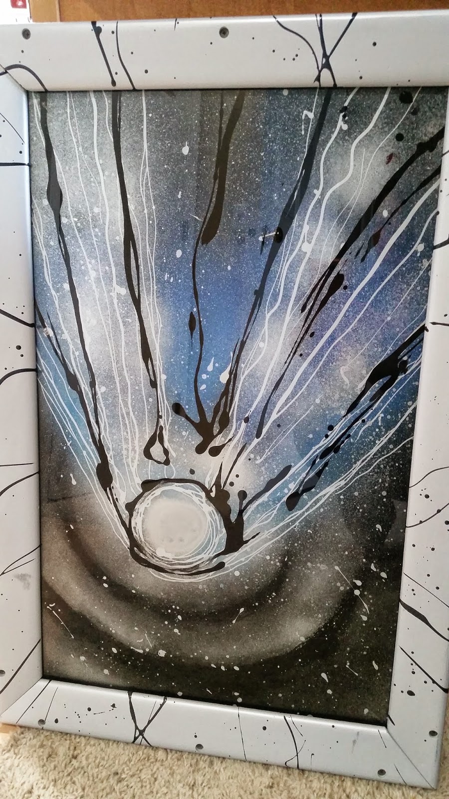
Years ago I bought a painting. It was the first piece of ART I had ever purchased. Before that we had prints and framed posters, but nothing that was an original piece, that was created by someone we knew, that nobody had the same thing. It felt very grown up at the time.
And then I got it home. And suddenly it felt like a mistake.
The painting that I had loved just a few hours before, that I had thought about buying for weeks before I actually did, was all of a sudden not so great. Not even not so great but a really expensive mistake. How in the world could that have happened?
Location. Location. Location.
See the artist was the husband of a woman I worked with. The first time I went to their place I was blown away. Their entire house was like an art gallery. Every room had pieces Ron had done. The main living room had his latest collection. Space scenes. Specifically the Hale-Bopp Comet. He painted on glass. Windshields from cars. Giant dormer windows. Huge impressive pieces. All different, but all in this theme. It was amazing. The piece I liked the best was a little different than the rest. Smaller, done in blues instead of the oranges of some of the other ones. But I loved it.
And I finally decided to buy it. As a friend I got a decent price so less than he would have sold it in a gallery but still a significant amount of money for us at the time. I loaded it very carefully in to the car and made my way home. Bringing it in to our house and deciding where to hang it....and...well...
The house like an art gallery was the perfect place for this piece. The very normal (normal seems good here, not sure what else to call it) house did not. Instead of a tiki bar in our dining room, we had a dining room table. Instead of a nail table with an airbrushing machine in our family room we had a sectional. Instead of an art gallery in our living room we had a couch. See? Just not quite the same. And this was a really strong picture. It stood out. And I regretted buying it. Because instead of loving this piece like I had now I looked at it and thought about how much I had spent, and it's not like I could return it, and how it absolutely did not go with our house.
A few years later C decided he wanted it in his room. And when we moved up here and his room was painted a brilliant blue it really did look nice in there. It fit. And I could once again look at it and think, I really like that piece.
Location. Location. Location.
The art didn't change. But the surroundings did and that made all the difference. It was a good lesson for me for future purchases. I can like something, even sort of love it, but that doesn't mean it's right for my house. Art has to work with the surroundings. It becomes a part of your whole world when you bring it home. And it should enhance everything around it. Not overwhelm it.
Now C has moved out and he didn't want to take the piece with him. A friend of a friend had mentioned once how much they liked the painting and so I have passed it along to him. He likes it, his daughter likes it. It's gone to a good home. And as silly as I know it sounds, that makes me feel better about giving it away. It's something that was created. An art piece. A painting. Someone made that. And now someone else can appreciate it.
I just hope they have the right place to hang it...

No comments:
Post a Comment